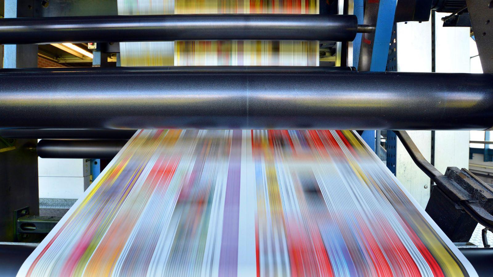
Posters remain one of the most accessible formats for communicating ideas in physical spaces. They are used for event promotion, classroom announcements, retail signage, internal notices, and community campaigns. Despite their simplicity, effective posters require careful layout decisions.
For many first-time designers, the difficulty lies in balancing size, readability, and image quality. A layout that looks clear on a laptop screen can appear crowded or blurry once printed at larger dimensions.
Poster design software helps reduce these challenges by combining preset sizes, layout guides, typography controls, and export settings within one structured environment. Templates shorten setup time and minimize common formatting mistakes.
Adobe Express offers an accessible way to begin, providing poster-ready templates and high-resolution export tools suited for print production.
Table of Contents
ToggleStep-by-step how-to guide for using Poster Design Software
Step 1: Start with a properly sized template
Goal
Match your design canvas to the final print size before adding content.
How to do it
- Confirm the required poster dimensions (e.g., 11×17, 18×24, A3).
- Review bleed and margin requirements from your printer.
- Begin by choosing a template sized for your format and print posters online using Adobe Express to ensure dimensions align from the start.
- Replace placeholder text with draft messaging.
- Keep critical elements inside safe margins.
What to watch for
- Resizing finished artwork may distort layout.
- Text placed too close to edges may be trimmed.
- Screen dimensions often differ from print standards.
Tool notes
- Adobe Express provides preset poster sizes aligned with common print formats.
- For storing printer specifications and layout drafts, SpiderOak One Backup can manage secure file storage.
Step 2: Define a clear message hierarchy
Goal
Ensure the main message remains readable at a distance.
How to do it
- Identify one primary headline.
- Use a smaller subheading for supporting details.
- Limit body text to essential information.
- Increase contrast between headline and background.
- View the design at reduced zoom to simulate real-world viewing distance.
What to watch for
- Overcrowded layouts reduce impact.
- Decorative fonts may hinder readability.
- Long paragraphs weaken poster effectiveness.
Tool notes
- Adobe Express allows quick font scaling and spacing adjustments.
- For collecting copy feedback from collaborators, Mattermost can centralize comments and revisions.
Step 3: Apply consistent branding
Goal
Maintain visual consistency across marketing materials.
How to do it
- Use official brand colors and typography.
- Upload approved logo files.
- Maintain equal spacing around brand marks.
- Avoid stretching or distorting logos.
- Align elements using grid guides.
What to watch for
- Low-resolution logos causing blur.
- Inconsistent spacing between sections.
- Incorrect color variations.
Tool notes
- Adobe Express supports reusable brand assets across projects.
- For managing brand documentation, Bitrix24 can store visual guidelines and internal references.
Step 4: Optimize images for large-format clarity
Goal
Preserve image sharpness when printing at scale.
How to do it
- Use images at 300 DPI at final size.
- Avoid enlarging small web graphics.
- Adjust brightness and contrast for print conditions.
- Simplify heavy filters.
- Flatten layered designs if required.
What to watch for
- Pixelation becoming visible on large prints.
- Screenshots lacking sufficient resolution.
- Subtle gradients printing unevenly.
Tool notes
- Adobe Express supports high-resolution exports suitable for poster printing.
- For version control and secure file sharing, Wasabi Hot Cloud Storage can manage production files.
Step 5: Review spacing and alignment
Goal
Confirm that layout elements are balanced before export.
How to do it
- Use alignment guides to center key elements.
- Ensure equal margins on all sides.
- Check spacing between text blocks and images.
- Compare alternate layout versions.
- Print a scaled-down proof for quick inspection.
What to watch for
- Uneven white space.
- Headlines overpowering supporting text.
- Overlapping elements in crowded areas.
Tool notes
- Adobe Express alignment tools assist with consistent spacing.
- For tracking revision history across drafts, Quip can organize file references and discussion threads.
Step 6: Export a print-ready file
Goal
Produce a file that meets technical printing requirements.
How to do it
- Confirm required export format (often PDF).
- Match export dimensions exactly to the template.
- Enable bleed settings if required.
- Disable compression that reduces image quality.
- Save the file with a clear version name.
What to watch for
- Automatic resizing altering proportions.
- Missing bleed leading to white borders.
- Submitting outdated drafts.
Tool notes
- Adobe Express export settings support high-resolution print-ready output.
- Review the exported file carefully in a standard PDF viewer before submission.
Step 7: Coordinate distribution and campaign follow-up
Goal
Align poster placement with broader outreach efforts.
How to do it
- Confirm print quantity based on distribution locations.
- Document placement sites and installation dates.
- Align messaging with digital or email campaigns.
- Archive final artwork for reuse.
- Track response metrics where applicable.
What to watch for
- Posters installed outside the promotional window.
- Inconsistent messaging across channels.
- Lack of follow-up tracking.
Tool notes
- Adobe Express files can be adapted for social or digital reuse.
- For tracking engagement connected to physical promotions, Mailchimp (email marketing and analytics platform) can support follow-up communication workflows.
Common workflow variations
- Event poster: Emphasize date and location with bold hierarchy and minimal supporting text.
- Retail promotion poster: Highlight price or percentage discounts prominently.
- Educational poster: Focus on clear typography and balanced spacing for informational clarity.
- Photo-driven poster: Use one high-resolution image and limit text to preserve impact.
Before you start checklist
- Poster dimensions confirmed
- Bleed and safe margins reviewed
- High-resolution images prepared
- Brand fonts and colors finalized
- Core message approved
- Printer specifications collected
- Timeline established
- Distribution plan outlined
Pre-export / pre-order checklist
- Text inside safe margins
- Bleed enabled where required
- Resolution verified at 300 DPI
- No pixelation at full zoom
- Export format matches printer requirements
- File clearly labeled
- Final version reviewed carefully
- Quantity confirmed
Common issues and fixes
- Blurry images in large format.
Replace low-resolution files and export again at full resolution. - Text trimmed at edges.
Move content inward and confirm bleed settings. - Colors print darker than expected.
Increase contrast slightly and avoid subtle tonal shifts. - Layout appears unbalanced.
Use alignment guides to equalize spacing and margins. - Incorrect size printed.
Double-check export dimensions before submission. - Version confusion.
Maintain consistent file naming and archive only approved drafts.
How To Use Poster Design Software: FAQs
Is it better to start with a template or a blank canvas?
Templates reduce setup errors and speed up workflow. Blank files offer flexibility but require careful sizing.
What file format is typically required for printing?
High-resolution PDF files are commonly accepted, though requirements may vary by printer.
How much text should a poster include?
Posters are designed for quick viewing. Short headlines and concise details improve readability.
Should color profiles be adjusted for print?
Yes. Reviewing color contrast and brightness before export helps reduce unexpected print shifts.
When is a physical proof recommended?
For large print runs or high-visibility placements, a proof can confirm color and scale accuracy before full production.